Knuckies
-
Product Design
-
-
Challenge: Addressing Smartphone Waste and Design Limitations
Smartphones have become a global phenomenon, resulting in a massive environmental impact due to their production, consumption of rare metals, and generation of CO2 emissions. Moreover, the alarming number of discarded phones each year adds to the growing e-waste problem. In response to this challenge, Michael Diaz and Mike Ideas partners developed Knuckies, an innovative phone stand with a human-centered design approach.
Solution: Knuckies – Redefining Phone Stands
Knuckies revolutionizes the concept of phone stands by offering a solution that combines functionality, sustainability, and playfulness. Designed to be 3D printed and attached using high-strength 3M adhesive tape, Knuckies aims to provide a comfortable and secure grip on smartphones while reducing their contact with surfaces, thus minimizing the risk of accidental drops and damage.
Unlocking Possibilities with 3D Printing
Knuckies leverages the capabilities of 3D printing, making the design available for on-demand production through platforms like Shapeways, a renowned 3D printing service based in New York. Additionally, the design can be downloaded and customized via the online 3D object platform 3DCults. Knuckies gained recognition from prominent 3D printing media platforms such as 3D Printing Industry, Sculpteo, and Nerdophile, showcasing its potential to disrupt the limitations of traditional printing methods with its fully articulated zero-assembly interlocking hinges.
Overcoming Design Flaws and Embracing Utilitarianism
The utilitarian design language of Knuckies addresses the ergonomic challenges, instability, dirt accumulation, and hinge deterioration faced by other phone stand options in the market. The comfortable rounded finger rings, taller and stable standing modes, and pocket/necklace hook feature all contribute to a user-friendly experience while promoting the responsible use of smartphones and minimizing waste.
Pioneering Innovation and Design
Knuckies took the market by storm as the first bearing-equipped phone stand, predating the popular fidget spinners by four years. The initial design incorporated a smooth and fast-spinning bearing mechanism, which later evolved into a fully 3D printed hinge approach that offered a seamless spinning experience with use. While other products like Pop Sockets and iRings dominated the phone stand industry, Knuckies sought to redefine what a great phone stand could be and how design could contribute to reducing smartphone waste.
The Evolution of Design and User Experience
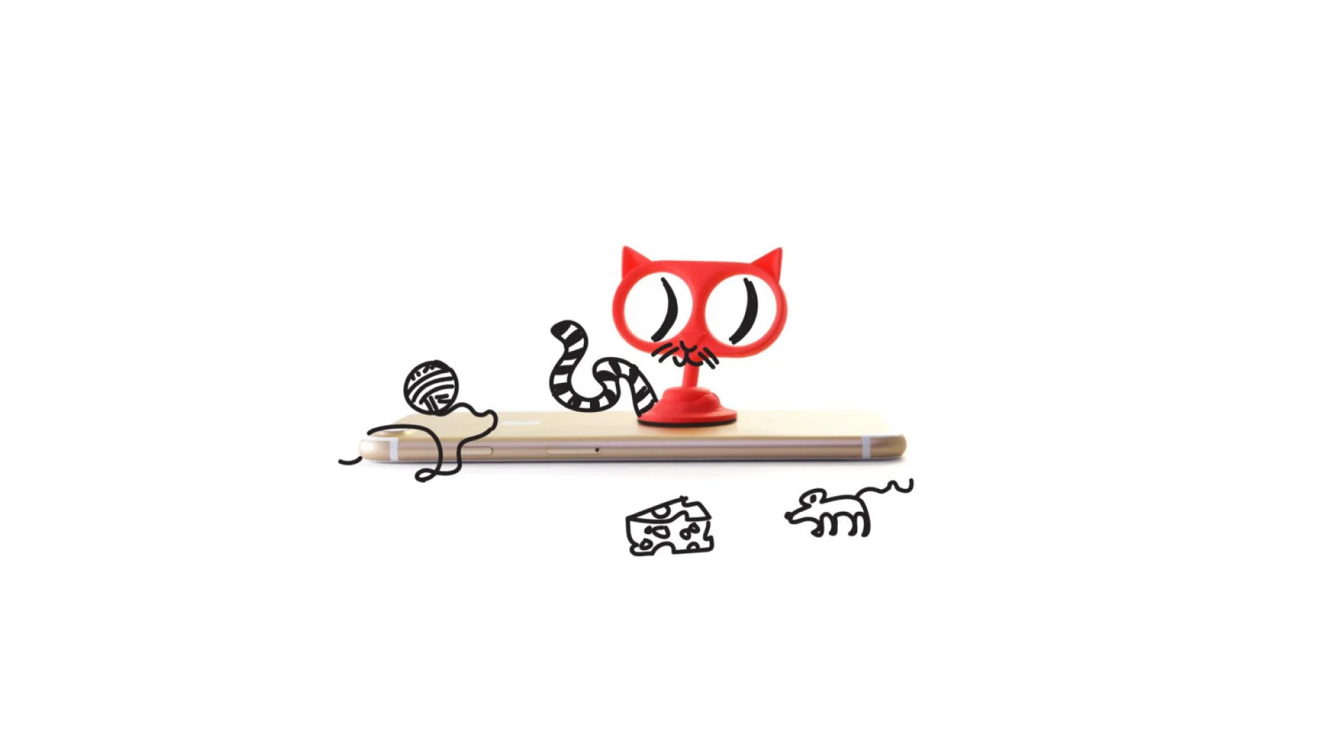
The development of Knuckies involved exploring various designs to bring an analog experience to a market dominated by homogenous design choices. Designs such as anchors, loops, lollipops, mop “T”s, and a cute cat design allowed shoppers to express their individuality while contributing to the evolution of the phone handle. The final design, the Black “Anchor Ring,” was refined through the feedback of thousands of phone spinners, chosen for its enduring color and versatile hook functionality.
The rounded elements of the current design were carefully crafted with user comfort and convenience in mind. The design considers pocket storage by reducing abrasion for quick retrieval and incorporates finger-contouring at the base for extended use. The innovative standing feature creates an elevated tripod with two rings, extending in an arch from the phone to provide a unique 60-degree viewing angle.
Educating Users and Future Innovations
Knuckies provides educational videos that guide customers on the safe application and utilization of the product. These videos demonstrate the versatility of Knuckies through different designs and colors, showcasing various use cases. In pursuit of continuous innovation, a prototype by Andrés Belisario explores a sleek future-punk aesthetic, incorporating Magsafe mounting for easy attachment and detachment.
Refinement, Brand Identity, and Environmental Consciousness
Michael’s dedication to perfection led to over 82 prototype designs to refine the bespoke Knuckies phone handle. The brand’s website, graphic language, and identity continually evolve to align with the dynamic nature of the smartphone accessory industry. Initially trademarked with a “smiling face” derived from the first bearing-equipped model’s outline, the Knuckies logo now features a simplified side silhouette of the Knuckies “ring” housing the wordmark. This forward-leaning design symbolizes the brand’s commitment to evolving smartphone design language toward a sustainable future.
Empowering an Active Lifestyle and Responsible Phone Use
The photography and graphic elements associated with Knuckies embody motion, adventure, and an active lifestyle. They reflect the brand’s mission to question the significance of phone usage, the privilege it represents, and the cultural responsibility to harness this power consciously. As Knuckies continues to challenge conventional phone holding practices, it inspires users to rethink their relationship with their devices and take steps toward a future that honors the human form.
Client
Knuckies
Mike Ideas Studios
Sector
Retail
Discipline
Product Design
Product Photography
Video Production
Office
Winter Park, FL
Project Team
Michael Diaz
Emilio Lopez
Andrés Belisario