Broaden
Brand Identity, Digital Design, Art Direction
Blindfolding and introducing people to promote empathy and understanding.
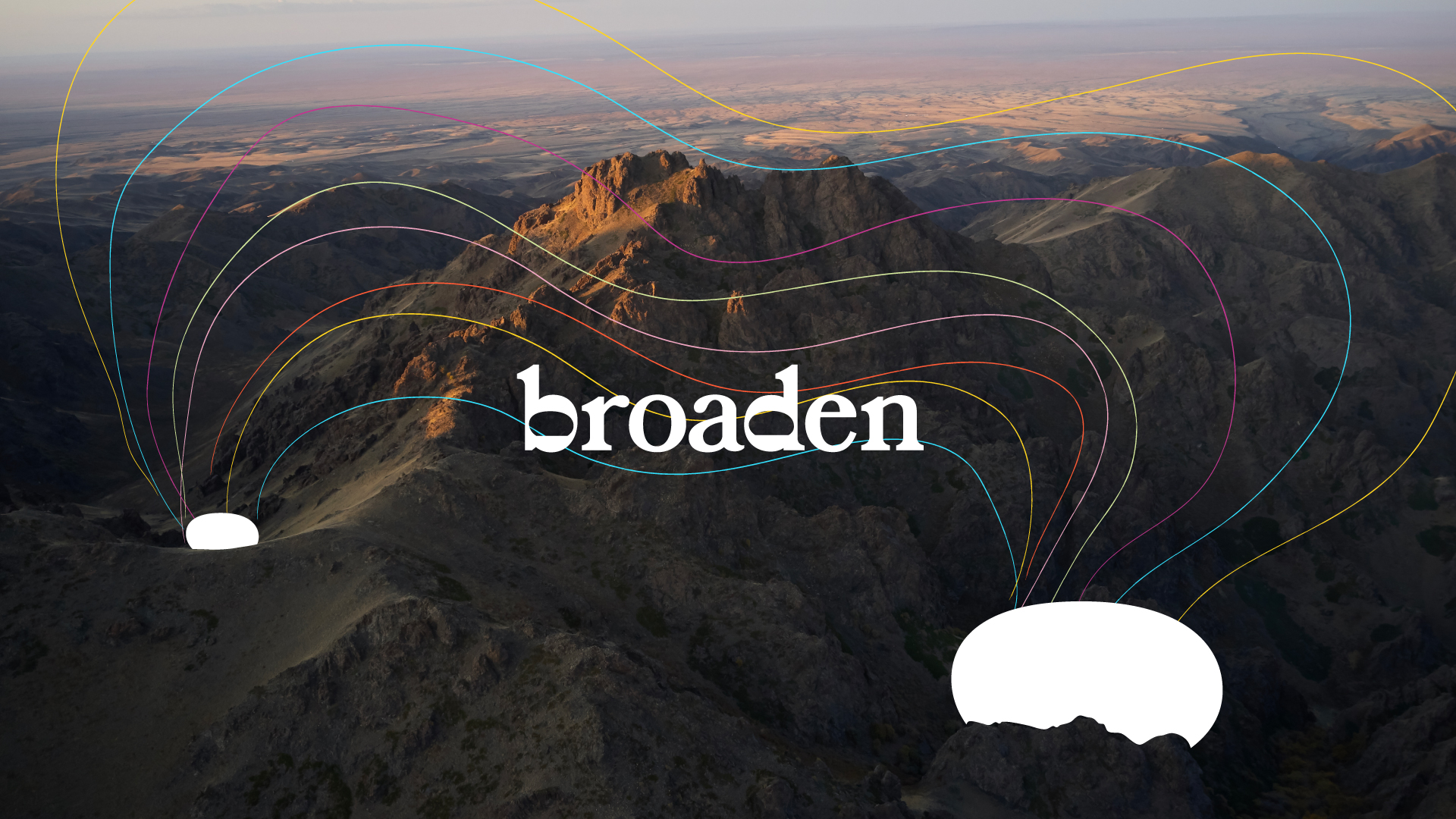
"This unique social activism project empowers people to create blindfolded icebreakers."
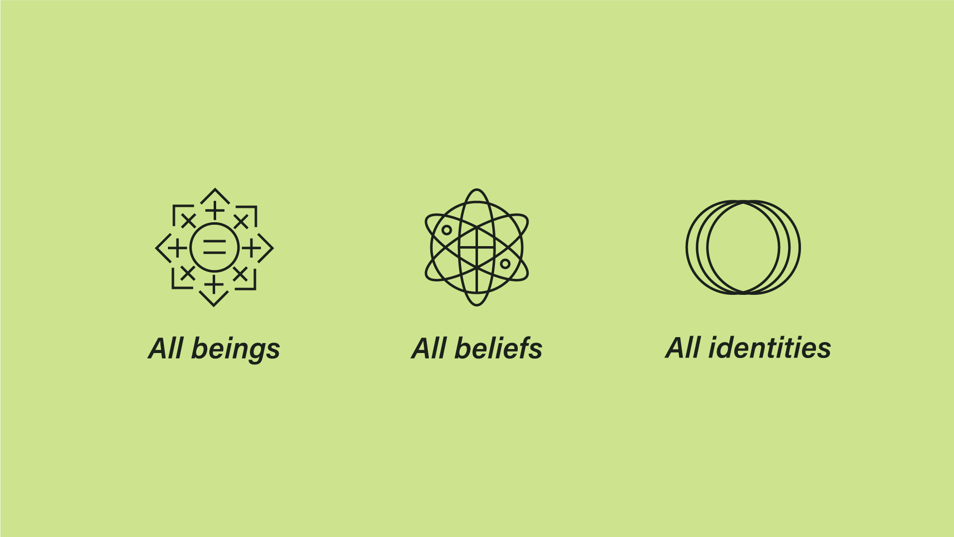
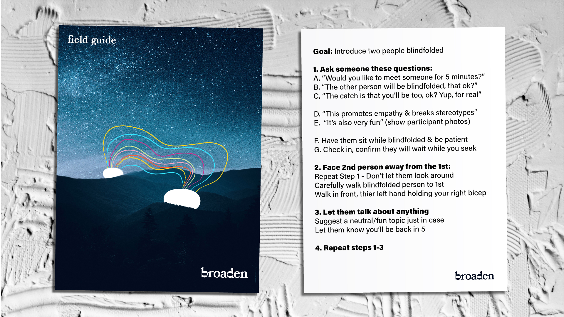
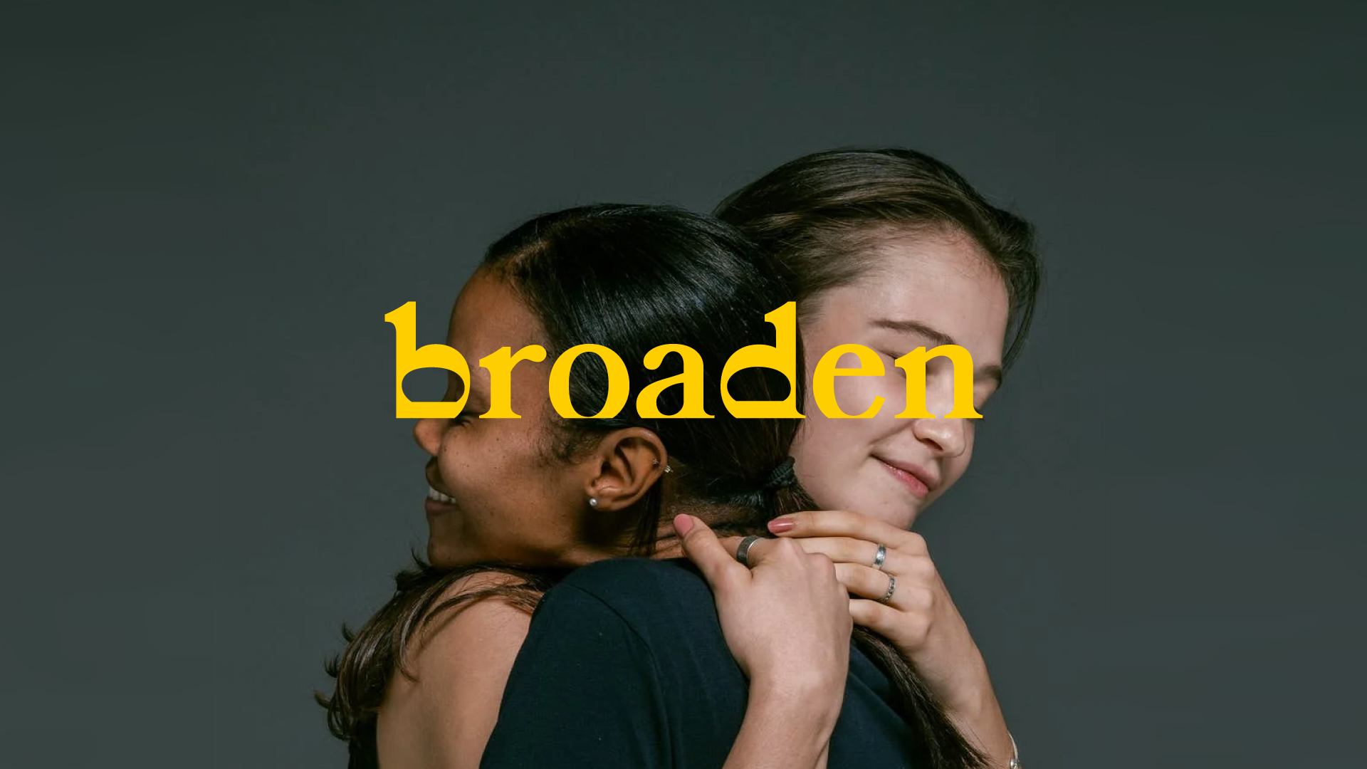
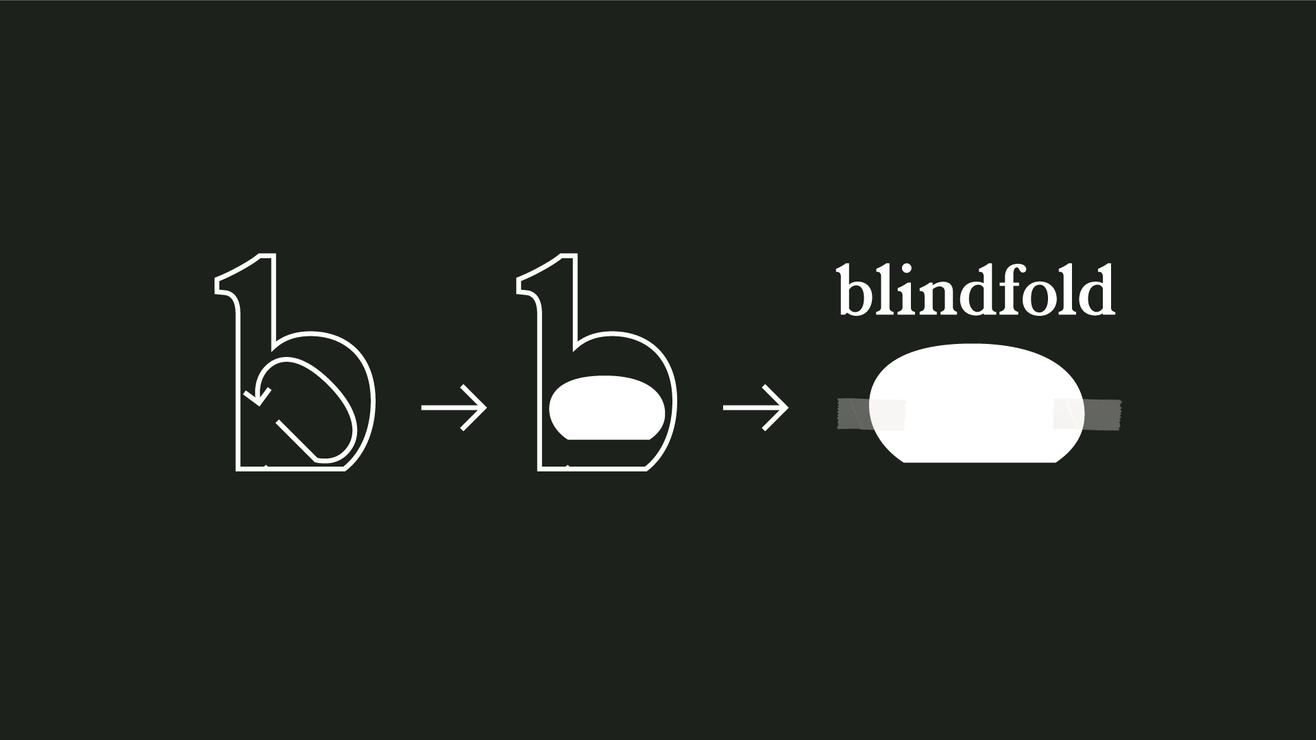
"we rotated the hole within the letter "b" to create a widened sun on a broad horizon line"
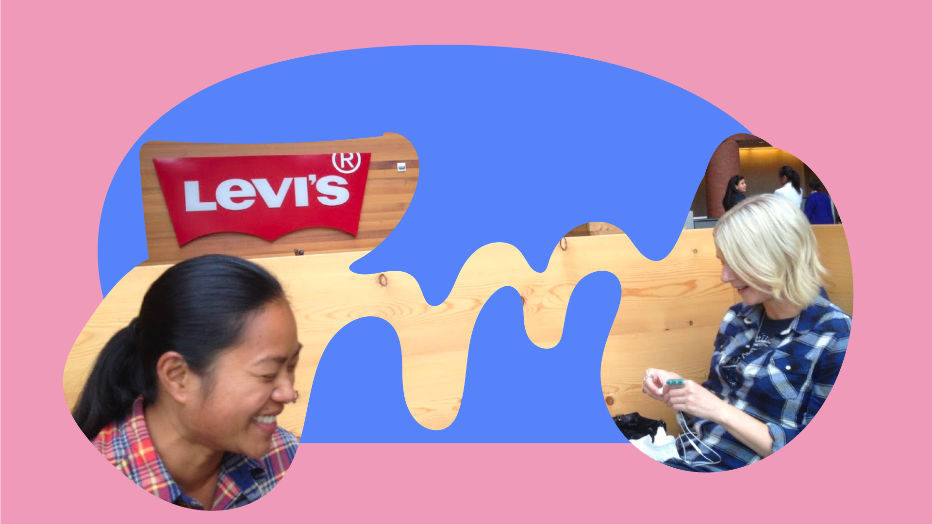
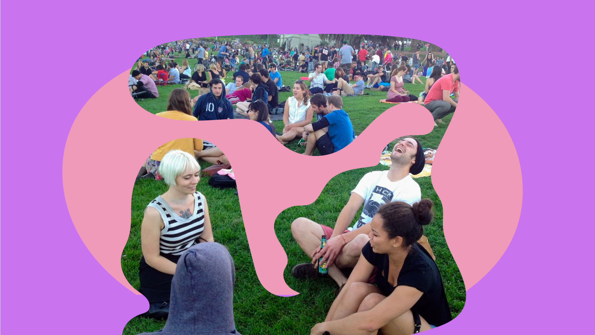
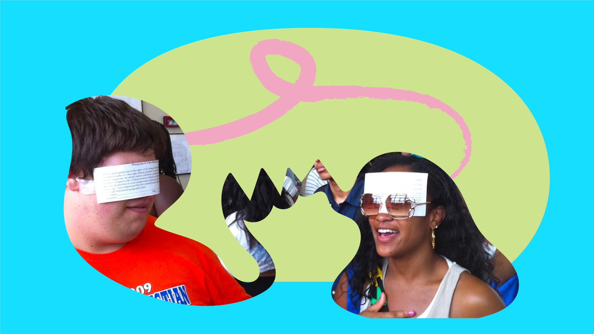
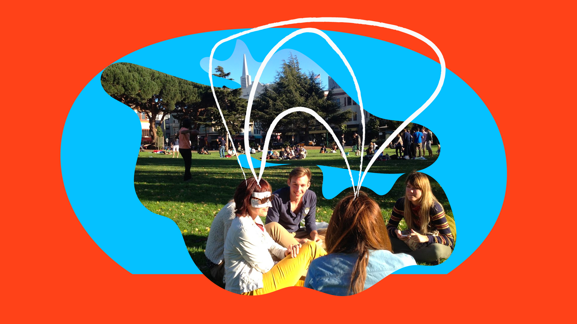
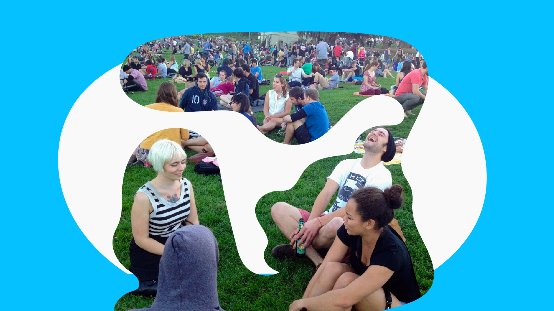
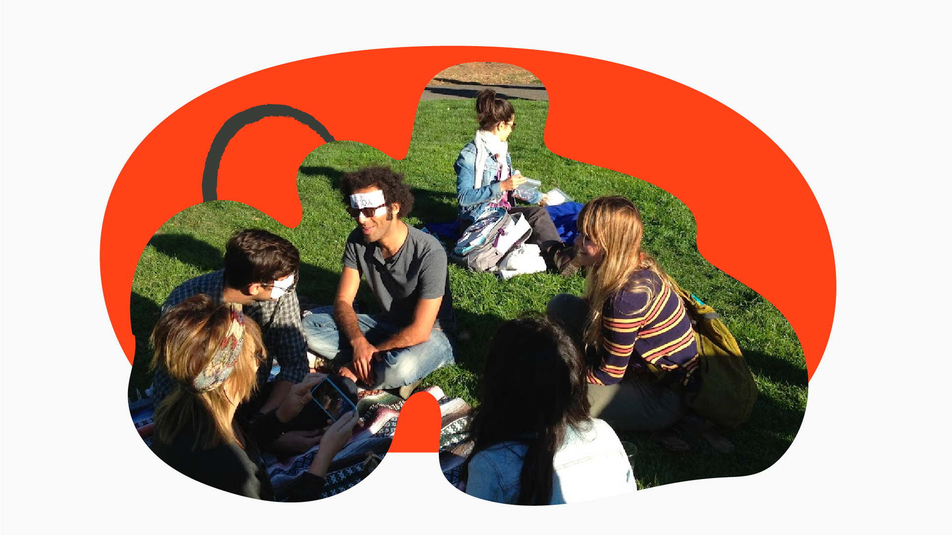
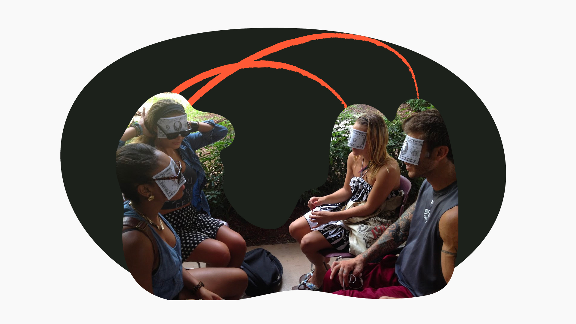
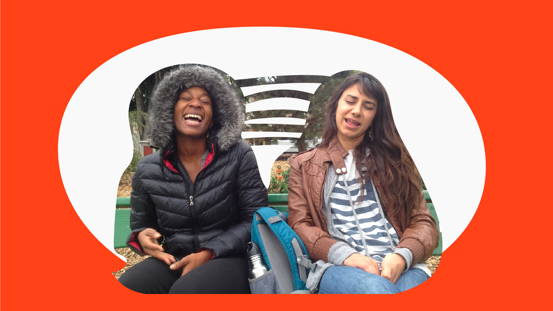
"introduce students, teachers, pedestrians, commuters, strangers, dancers, musicians, neighbors, coworkers, roommates, family, friends, anyone "
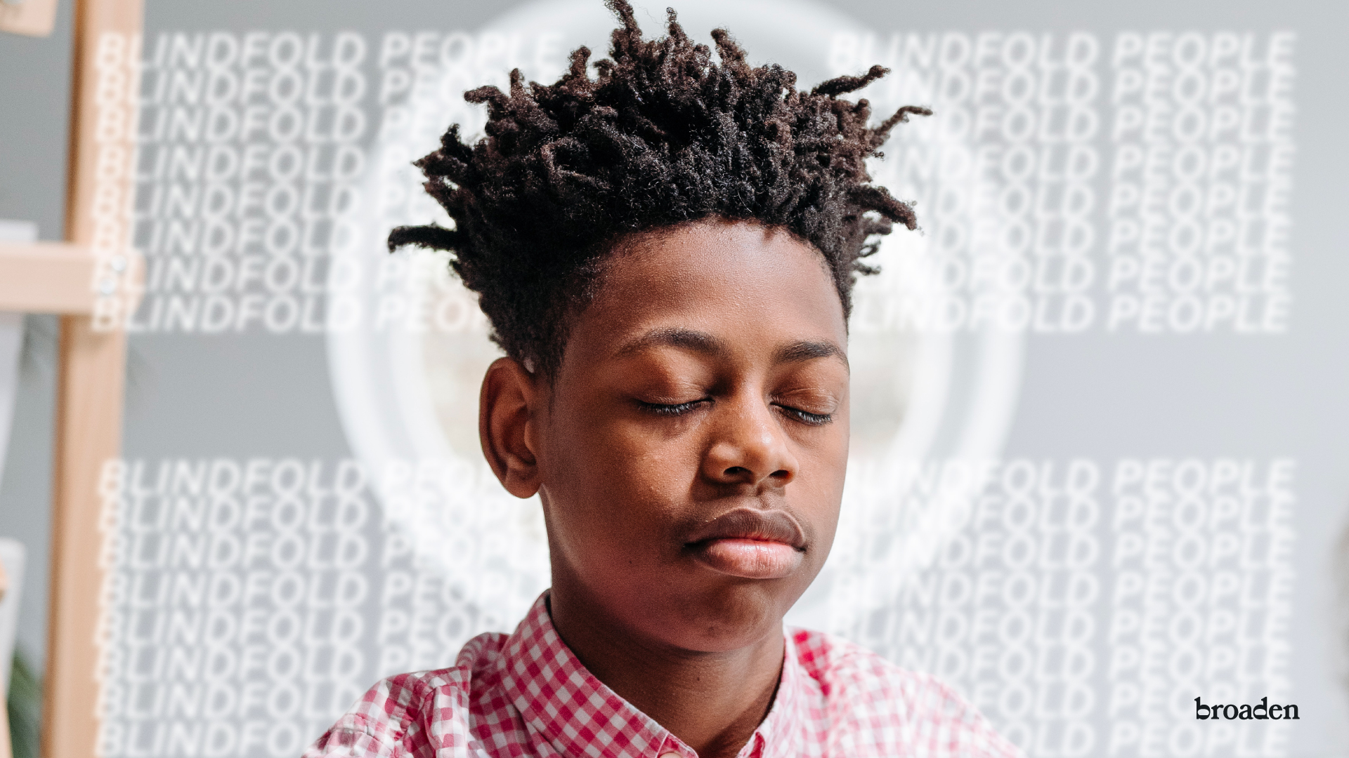
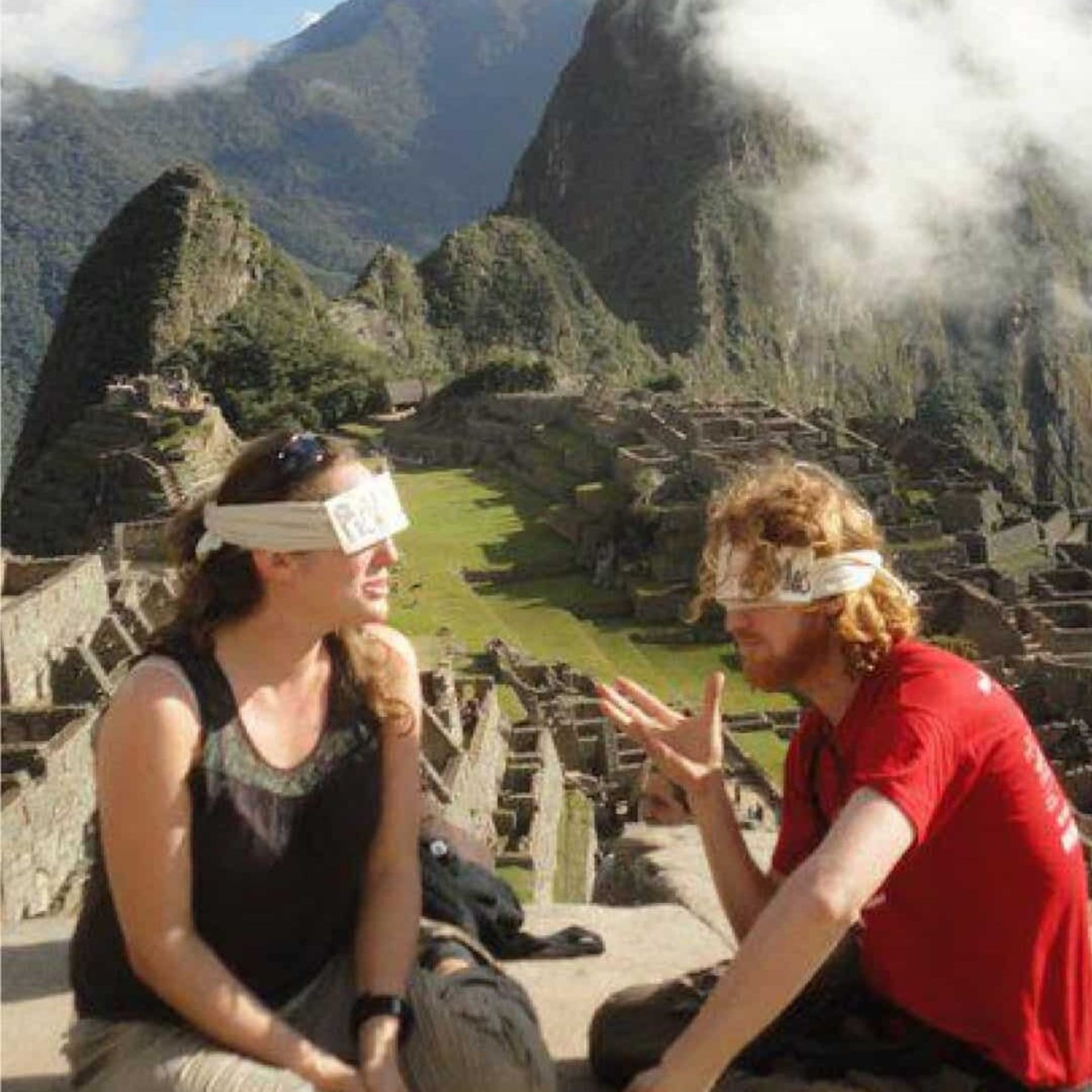
Solution: Sensory-Deprivation Icebreakers
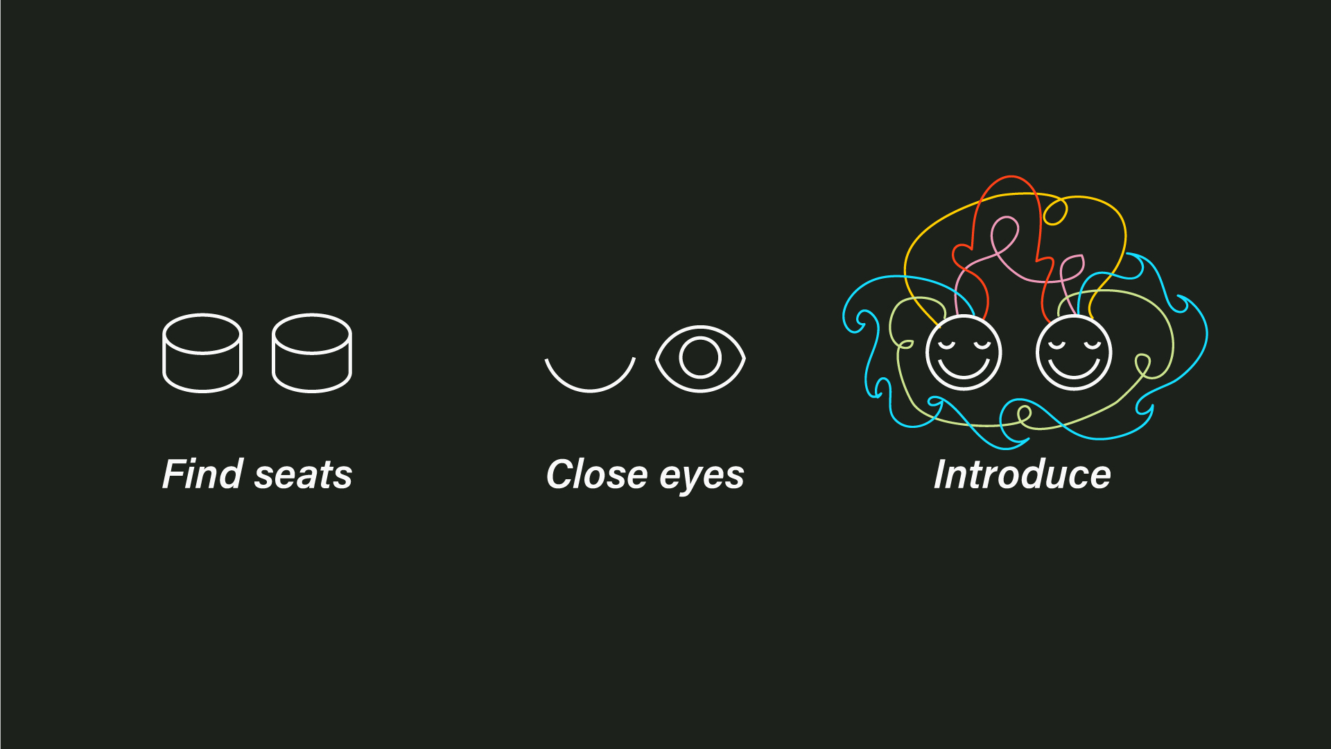
The project began with an innovative approach at the University of Central Florida, where fellow students were blindfolded and introduced to each other in common areas. The initial success, with two participants forming a lasting relationship, led to the evolution of blindfolded icebreaker activities using various materials and expanding to group interactions. Professor Cynthia Hutchinson from the College of Health Education and Human Performance played a vital role in facilitating blindfolded icebreakers for entire classrooms on the first day of the semester.
Empowering Volunteers and Engaging Participants
Broaden gained momentum as a grass-roots social initiative, relying on countless volunteers who facilitated events using the free, engaging, and versatile Broaden tools. Printable blindfolds made from 8.5×11 paper, detailed facilitation instructions, and categorized question lists empowered volunteers with the confidence to introduce complete strangers in a blindfolded setting. Sensory-deprivation was used as a means to reduce inhibitions, enhance active listening, and create an environment conducive to mindful discussions.
Embracing Diversity and Adaptability
Diversity lies at the core of Broaden’s ethos, with each blindfolded icebreaker format dynamically adapted to the audience size and background. The interactions are never the same, as different questions, blindfolds, and seating configurations are improvised to facilitate conversations. Over 5,400 participants have engaged in Broaden’s blindfolded icebreaker activities, fostering connections and breaking down barriers.
Visual Identity and Brand Messaging
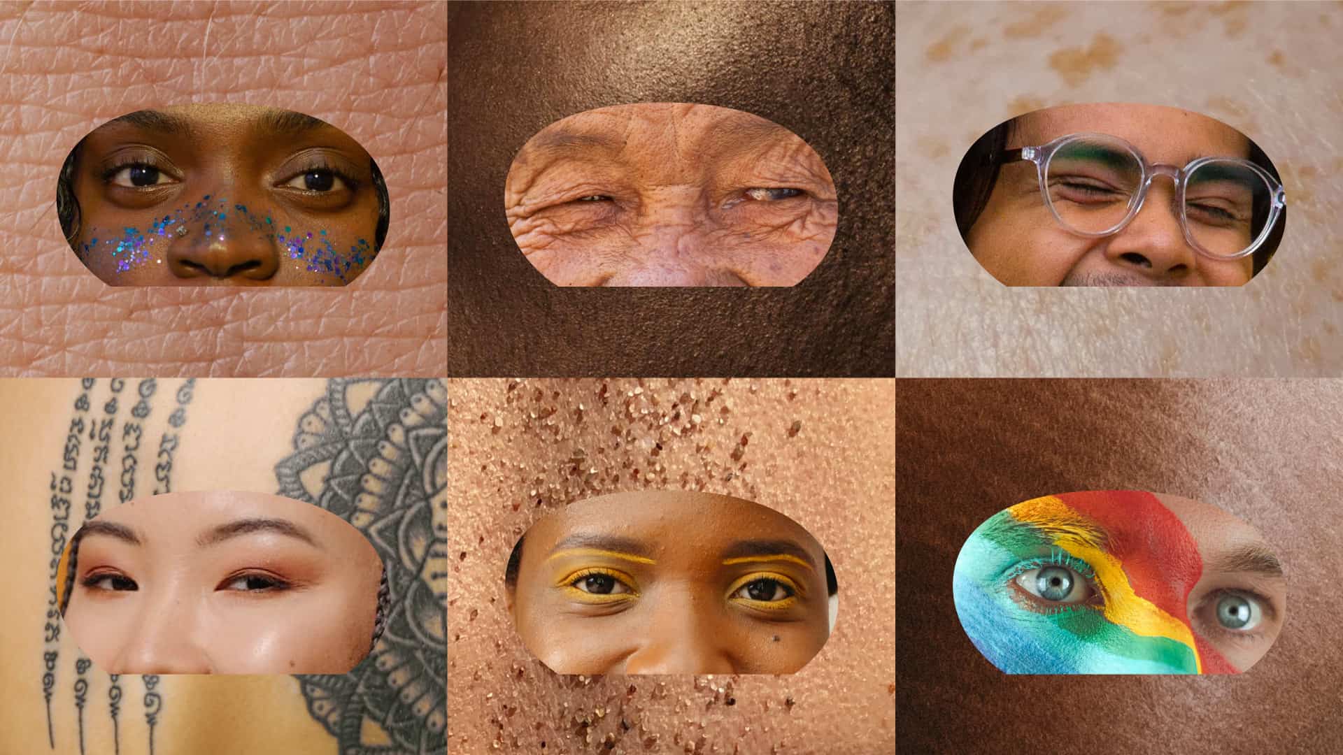
The logo and visual language of Broaden draw inspiration from the Pentagram identity for Warner Records. The fused double sunrise logo symbolizes the power of introductions in broadening horizons. The mask-shaped logo, when cut out of digital rectangles, reveals participant faces and serves as a sponge to display photos. The digital blindfold in the logo represents the core message of the brand—that the future of communication is open and accepting.
Typography and Colors
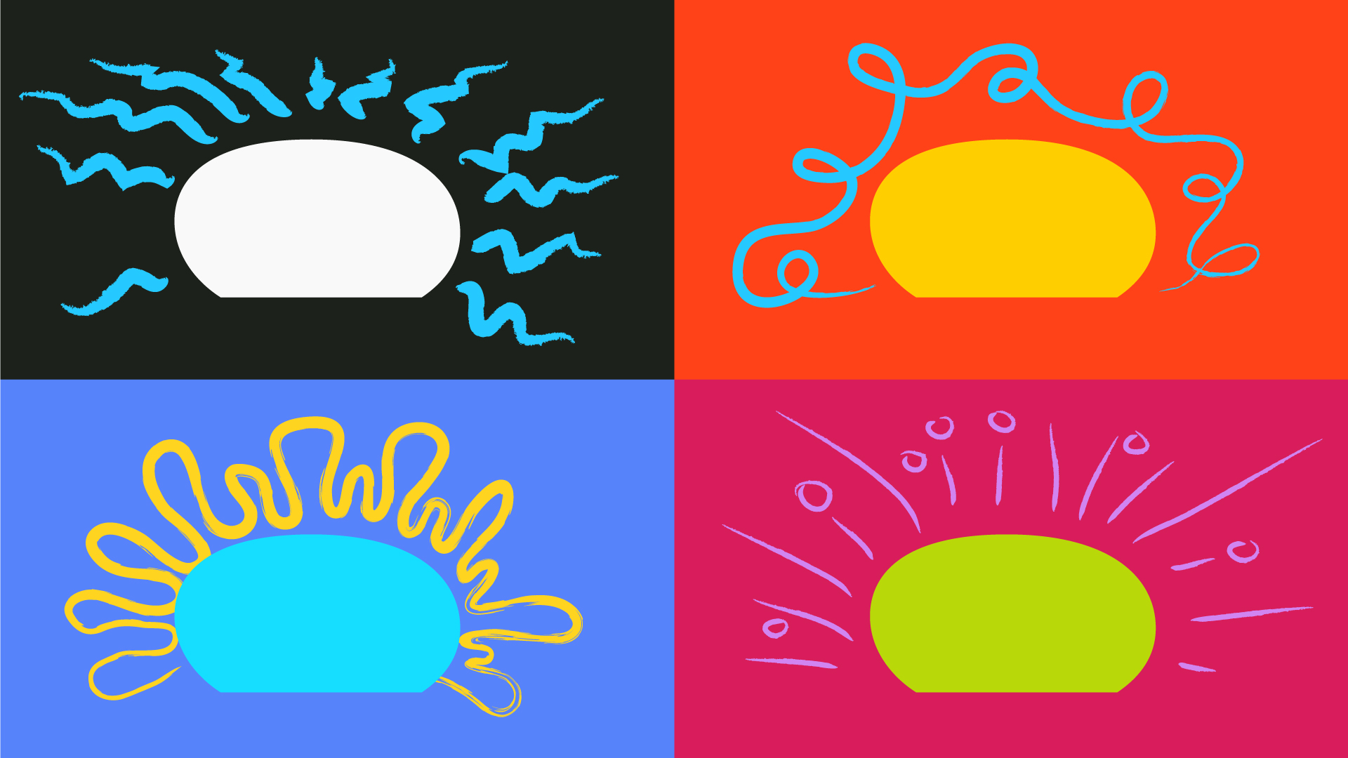
The typography used in Broaden’s branding is retro-inspired, evoking a sense of a simpler time when in-person conversations were valued over texting. The widened sun trademark further reflects this nostalgic feel. The color spectrum incorporates warm yet bold tones associated with sunlight, happiness, playfulness, vitality, and friendliness. Splashes of orange and black subtly evoke the identity-blurring nature of Halloween.
Photography and Website
Bright and together-forward photography sourced from platforms like Pexels and Unsplash captures Broaden’s personality, providing viewers with an emotional connection and anchoring them to the connecting and empathetic side-effects experienced through blindfolded introductions. Michael Diaz also designed and developed the Broaden website, which housed question lists, blindfold templates, and how-to guides to attract and engage new advocates.
Continued Impact
The spirit of Broaden lives on as teachers continue to utilize the blindfolded icebreaker method, fostering connections and empathy. The project has forged lasting friendships that originated from blindfolded introductions, demonstrating the enduring impact of this unique approach to fostering acceptance and understanding.
