Pop Design
-
Brand Identity
Strategy
Copywriting
Packaging Design
Web Design
Product Design
Positioning
Product Photography
Listing Design -
Challenge: Creating a Brand Identity for Pop Design
Pop Design, a new Amazon-centric brand created by Kannyn MacRae, aimed to deliver functional, emerging technology-driven products that enhance people's lives. The challenge was to establish a brand identity that captured the essence of the brand and appealed to a broad demographic.
Solution: Michael’s Contribution to the Brand Identity
Leveraging Kannyn MacRae’s personality as an avid mountain biker, Michael collaborated to create the name and brand identity for Pop Design. The goal was to express a joyful adventure-seeking spirit powered by approachable innovation.
Logo Design: Reflecting Design Thinking and Approachability
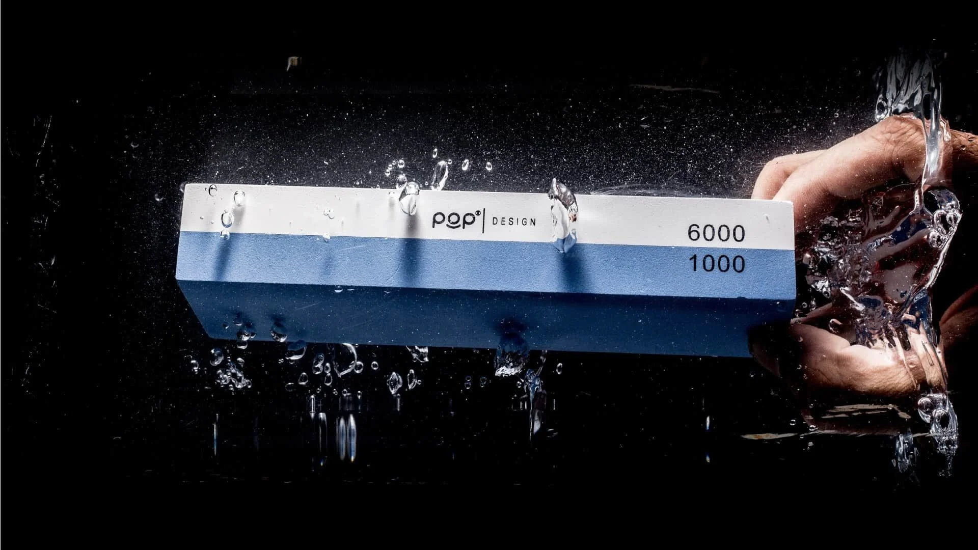
The “Pop” monogram logo, featuring an altered version of the Arista Pro typeface, was designed to evoke the bubbly feeling one gets from pushing a new toy’s circular power button. The smiling cyclops ‘o’ within the logo symbolized Pop Design’s commitment to design thinking in product development.
Typography and Visuals: Balancing Playfulness and Utilitarianism
The brand system incorporated Oswald, Poppins SemiBold, and Roboto Condensed as primary typefaces. The “Pop” lettering exuded a friendly and playful disposition, while the typeface “design” struck a balance between utilitarian and airy aesthetics. The visuals complemented the typography, incorporating a smiling Arista Pro ‘o’ to add emphasis when needed.
Credibility and Packaging: Reinforcing Brand Identity
To establish credibility, the branding was consistently integrated into image galleries and directly on products, using the smiling ‘o’ as a symbol of Pop Design’s intention to make “Life Better.” Thoughtfully crafted packaging, featuring the brand mantra and accessible customer phone support, further enhanced the brand identity. Spot gloss elements helped the products stand out.
Automation and Consumer Insights: Empowering Growth
To streamline growth, Pop Design’s stock was housed and fulfilled by Amazon(FBA). A Shopify website equipped with automatic Amazon shipping was created, allowing convenient and automatic order delivery without added intervention. This successful launch provided valuable consumer insights typically hidden from Amazon vendors.
Image Galleries and Enhanced Content: Presenting a Cohesive Narrative
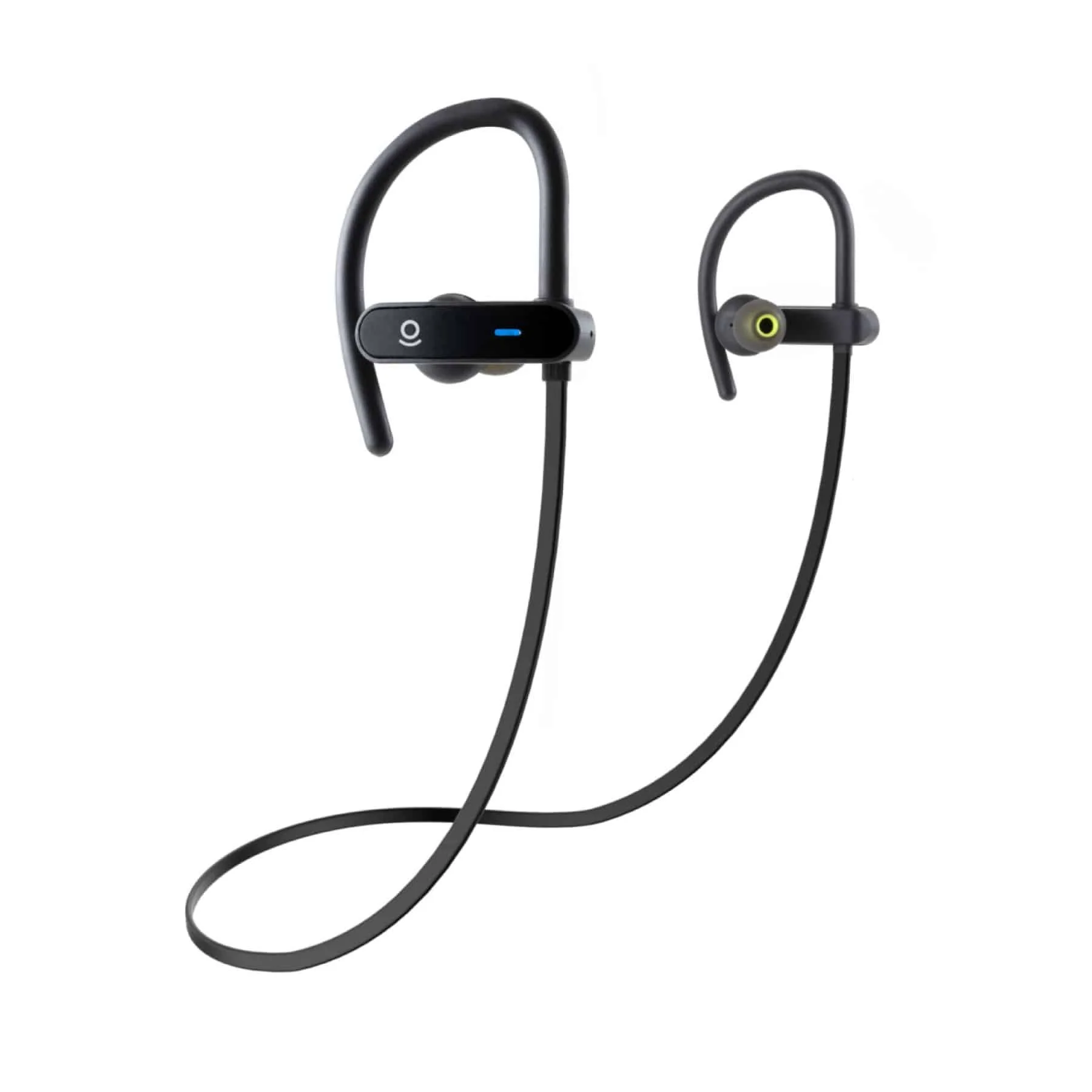
Michael and his remote creative team collaborated with Kannyn MacRae to create over 31 Amazon product image galleries. Each gallery featured extensive infographics and Enhanced Content assets, showcasing product strengths, features, and uses. The highly-specialized product shots, lifestyle imagery, copyrighting, icons, and print materials combined to present a cohesive brand narrative.
Product Descriptions and Conversion Optimization: Ensuring Dependability
Exhaustively detailed product descriptions, manuals, and instructions were provided to mitigate customer service calls and defend algorithm-sensitive product credibility. Distinct and emotionally compelling image gallery treatments, including A/B testing of flat white product ‘hero’ shots, were employed to optimize conversion rates.
Brand Promise: Reliability and Support
Pop Design’s quality-centric approach, leveraging design to make “Life Better” for everyone, was backed by warranties and on-demand customer support. The new brand identity captured the promise of reliability with strength and a smile.
Testimonial: Recognizing Michael’s Contribution
Kannyn MacRae, Owner and Founder at Pop Design adds: “I couldn’t be more grateful and proud of what we have done to help Pop thrive in a competitive Amazon area. Michael was instrumental in its conception and will continue to be so in its continued evolution.”
Client
Pop Design Products
Sector
Online Retail
Discipline
Brand Identity
Digital Design
Web Design
Graphic Design
App Development
UX Design
Packaging Design
Motion Graphics
Product Photography
Office
Los Angeles, CA
Project Team
Kannyn MacRae
Nima Ahmadinejad
Michael Diaz
Additional Project