Push Agency
-
Social Media Strategy
Presentation Design
Art Direction: Animations -
Challenge: Updating Push's Brand Identity and Social Media Strategy
Push, a prominent advertising agency in Central Florida, sought to refresh its brand identity and social media strategy. Their goal was to connect with potential clients by providing tangible value and establishing themselves as a resource for objective, industry-specific insights. Michael, in collaboration with Push's CEO Mark Unger and his team, took on the challenge of visually expressing the agency's unique approach and helping brands grow permanently from within.
Solution: Developing the New Logomark and Social Media Content
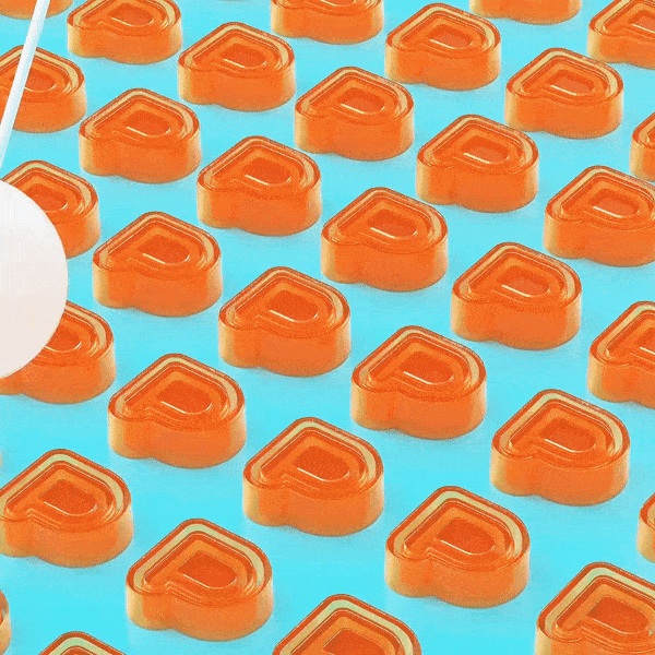
To tackle the challenge, Michael art directed multiple visualizations of the agency’s new logomark, the “Master P.” This new multi-layered symbol, a capital “P” rippling from the center with increasing fidelity, embodies Push’s approach of “pushing” clients to reach their full potential from the inside out. The narrative behind the visual reflects Push’s role in assisting brands in activating their inner identity to inform external actions, products, services, messaging, and strategies.
Alongside the new logomark, Michael worked closely with the Push team to develop a comprehensive social media content and strategy. The aim was to harmonize and standardize various post categories that would reinforce the agency’s commitment to diving deeper, conducting intentional consumer research, and creating meaningful connections with strength, individuality, and content.
The Collection of Social Media Post Categories
Push introduced a collection of social media post categories that helped batch and harmonize their content. Each category served a specific purpose and contributed to the agency’s overall message of going beyond the surface:
Dear Diary: A collection of entries from Pushers, including drawings, writings, and other creative expressions from the team.
Lost & Found: Sharing design and art inspiration that inspires.
Critical Mass: Exploring visual strength in numbers through thought-provoking visualizations.
Horcruxes: Presenting personal effects from the Push team, showcasing their meaningful possessions.
My Precious: Highlighting inspiring objects worth discussing.
Master P: Showcasing the new Push logo, the “Master P,” visualized beautifully by new artists.
Made You Look: Posts worth a read and discussion, such as insightful Push blog posts.
Deja Vu: Featuring past Push work that deserves a second look.
Forced Fun: Sharing fun activities and experiences the Push team enjoys together.
Attention Please: Announcements, job postings, holidays, new hires, and other good news from Push.
These post categories combined to reinforce the agency’s commitment to delving deeper, conducting intentional consumer research, and creating strength, individuality, and connection.
The Typographic Treatment and Framework
To visually harmonize the various posts, a typographic treatment was employed, featuring a system of corner-locked titles to convey information. This recurring theme of posts overlaid with type subtly conveyed that Push is a “knowledge-forward” editorial resource, distinguishing them from their photography-centric competitors on Instagram.
The framework introduced a digestible and cohesive system that activated existing and original content with an editorial and defensible continuity. While post formats like “Critical Strength,” “Lost & Found,” and “My Precious” facilitated a wide array of user-generated content, “Deja Vu” and “Made You Look” provided platforms to highlight decades of expertise. The framework also allowed the internal team the creative freedom to showcase their meaningful possessions and document agency experiences through the “Dear Diary” and “Horcruxes” post types.
Breathing Life into the Launch of the Logomark
To bring the new logomark to life, Mike Ideas curated content and sourced talent artwork for the “Master P” category of posts. Leveraging the Dribbble.com platform, Michael Diaz coordinated the creation of the first round of six “Master P” visualizations. These distinct and innovative works of art aligned with Push’s deep experience in specific industries, evoking luxury retail, dining, and the agency’s odd-ball roots through fur, pearls, hypnotizing drink coasters, jello growing pendulums, and abstract, vibrant iterations.
The visualizations tied into Push’s commitment to helping brands connect emotionally and grow permanently from within, reflecting their genuine intention for good. They captured the agency’s unique approach, resilience, and relatability while showcasing their expertise and creating meaningful connections with clients.
Overall, Michael’s collaboration with Push resulted in a refreshed brand identity, an engaging social media strategy, and a cohesive framework that effectively communicated Push’s values, expertise, and commitment to pushing brands to their full potential from the inside out.
Client
Push
Sector
Agency Services
Discipline
Art Direction
Office
Orlando, FL
Project Team
Mark Unger
Thomas Foglia Jr.
Tricia Hinds
Mike Diomede
Nick Chanovsky
Kevin Alves
Joe Tamponi
Filippo Odone
Alper Dostal
Michael Diaz